Global Fishing Watch has opened the doors to a new era of transparency and accountability in industrial fisheries. Our recent paper in Science: “Tracking the global footprint of fisheries” introduced this database to the scientific community and highlighted some of the potential research and management applications. One of these is to examine the global network of transnational fisheries (i.e., countries that fish in Exclusive Economic Zone’s (EEZ) of other countries) and ask: who fishes where? which countries fish the most in foreign waters? which EEZ’s are most heavily fished by foreign nations? what spatial patterns emerge from visualizing the inter-connectedness of transnational fisheries?
In this blog post, I’ll walk through how we used Global Fishing Watch data to make an interactive visualization of this network which is introduced in our recent publication: “Rapid and lasting gains from solving illegal fishing” published in the journal Nature Ecology & Evolution.
All the analysis is done in R, with Studio, using the following packages:
library(maps)
library(tidyverse)
library(rnaturalearth)
library(sf)
library(scales)
library(zeallot)
The dataset
Global Fishing Watch data has been made available for free here. This includes daily data of fishing effort by vessel at 0.1º resolution, and data of vessel characteristics including flag state, gear type, length, and others.
The first step is to summarize fishing effort by flag state and Exclusive Economic Zone. For that, we can use the EEZ shapefile provided by Marine Regions and spatially join it with the summarized 0.1º resolution fishing effort data. In this blog post I will skip this step - it will be a separate post soon - and instead focus on making the visualization.
Here is snippet of the dataset:
| flag | eez | fishing_vessels | fishing_days | fishing_hours | fishing_kWh | start_lon | start_lat | end_lon | end_lat |
|---|---|---|---|---|---|---|---|---|---|
| Albania | Croatia | 1 | 2 | 11 | 9630 | 19.11 | 40.93 | 15.65 | 43.43 |
| Albania | Italy | 1 | 5 | 33 | 28767 | 19.11 | 40.93 | 12.93 | 39.66 |
| Albania | Libya | 1 | 4 | 37 | 32158 | 19.11 | 40.93 | 18.50 | 33.14 |
| Albania | Malta | 1 | 8 | 103 | 88729 | 19.11 | 40.93 | 15.11 | 35.31 |
| Albania | Montenegro | 3 | 77 | 1083 | 313512 | 19.11 | 40.93 | 18.68 | 41.87 |
| Algeria | Italy | 3 | 12 | 116 | 42833 | 3.54 | 37.20 | 12.93 | 39.66 |
where:
flag: Flag state of the fishing fleet.eez: Exclusive Economic Zone of the country of territory being fished.fishing_vessels: Total number of fishing vessels active inside the eez.fishing_days: Total number of fishing days inside the eez.fishing_hours: Total number of fishing hours inside the eez.fishing_kWh: Total number of energy spent fishing inside the eez.start_lat,end_lat: Spatial coordinates of the centroid of the EEZ of the fishing flag state, with some exceptions.start_lon,end_lon: Spatial coordinates of the centroid of the EEZ, with some exceptions.
We have excluded here 1) the connections between EU members states 2) the EU Northern agreements with Norway, and Iceland, 3) connections between sovereign states, e,g: France and Reunion and 4) disputed or jointly managed marine territories.
CAVEAT: The coordinates here do not refer to the actual port, or coastline from where vessels are fishing from or fishing in. These are merely for national-level visualization purposes.
Making the dataset spatial
After importing the data, we need to convert it to a simple features dataframe, where each row corresponds to a line that connects the start and end points or - in our case - the flag state and the EEZ. For that we will use handy functions from the sf and purrr packages. If you are new to both these packages, two great tutorials are this purrr tutorial by Jenny Brian and Spatial Data in R: New Directions by Edzer Pebesma. Parts of this blog post are borrowed from the post Great circles with sf and leaflet by Martin John Hadley.
First, lets create a LINESTRING simple feature for each row of our dataframe and create a simple features dataframe of our data. LINESTRINGs are one-dimensional geometries the contain a “sequence of points connected by straight, non-self intersecting line pieces”. We can create them by making matrices of our start and end coordinates and then mapping the st_linestring() function across them. We also need to set the coordinate reference system to WGS84 as we are using lat/long coordinates.
network_data_sf <- network_data %>%
  select(start_lon, start_lat, end_lon, end_lat) %>%
  purrr::transpose() %>%
  purrr::map(~ matrix(flatten_dbl(.), nrow = 2, byrow = TRUE)) %>%
  purrr::map(st_linestring) %>%
  st_sfc(crs = 4326) %>%
  st_sf(geometry = .)%>%
  bind_cols(network_data) %>%
select(everything(), geometry)| flag | eez | fishing_vessels | fishing_days | fishing_hours | fishing_kWh | start_lon | start_lat | end_lon | end_lat | geometry |
|---|---|---|---|---|---|---|---|---|---|---|
| Albania | Croatia | 1 | 2 | 11 | 9630 | 19.11 | 40.93 | 15.65 | 43.43 | c(19.11, 15.65, 40.93, 43.43) |
| Albania | Italy | 1 | 5 | 33 | 28767 | 19.11 | 40.93 | 12.93 | 39.66 | c(19.11, 12.93, 40.93, 39.66) |
| Albania | Libya | 1 | 4 | 37 | 32158 | 19.11 | 40.93 | 18.50 | 33.14 | c(19.11, 18.5, 40.93, 33.14) |
We now have a special class of dataframe (a tibble to be precise) with a list-column that contains the geometry features we just created (i.e.,one LINESTRING per row). Lets use the function geom_sf() from the ggplot2 package to take a look at one line connecting Vanuatu to Chile:
world_map <- rnaturalearth::ne_countries(scale = 'small', returnclass = c("sf"))

network_data_sf %>%
  filter(eez == "Chile", flag == "Vanuatu") %>%
  ggplot() +
  borders()+
  geom_sf(col = "blue")+
  borders()+
  theme_minimal()+
  coord_sf(datum = NA)
Making Great Circles Work
The next step is to divide our LINESTRING - which currently has only two points - into multiple smaller segments along the corresponding great circle path. These great circles are what you often seen on airline magazines and represent the shortest path between two points on the surface of a sphere. The sf package has a handy function called st_segmentize() that does this and we can specify the length of each segment.
network_data_sf <- network_data_sf %>%
st_segmentize(units::set_units(100, km)) 
Oh no! While st_segmentize() worked and produced the correct path of the great circle, the function does not care about the dateline. In the future, this will be addressed in the sf package, but in the meantime we can manually re-scale our longitudes to [-180,180], which gives us:
network_data_sf <- network_data_sf %>%
  mutate(geometry = (geometry + c(180,90)) %% c(360) - c(180,90))
So close!! Our line does not know that it needs to break at the dateline. So, for this we wrap our LINESTRING around the dateline using the aptly named st_wrap_dateline() function. A side effect of the st_wrap_dateline() is that our geometry type is no longer LINESTRING but GEOMETRY. This is because each simple feature that crosses the dateline is split into two becoming a MULTILINESTRING. When we combine more than one type of single simple feature in a collection (e.g, MULTILINESTRING and LINESTRING), the overall geometry type becomes GEOMETRY.
network_data_sf <- network_data_sf %>%
  st_wrap_dateline(options = c("WRAPDATELINE=YES",  "DATELINEOFFSET=180"), quiet = TRUE) %>%
  sf::st_sf(crs = 4326)
Visualizing directionality
We now have our paths right, however, we still need to visualize the directionality. Where does a path start and end?. A common idea is to add arrows to the lines, but, since we will be plotting many many lines on the same graph this will not be optimal. My solution to this is to use a blue-red color gradient to represent the cumulative distance traveled from the starting point. This way we will have the starting points - representing sources of fishing effort - represented in blue, and end point - sinks of foreign fishing effort - represented in red. This will allow us to visualize patterns and hotspots more readily.
So, how do we do this? First, we need to unpack the LINESTRINGs into their coordinates, while keeping track of the line ID’s. Second, we calculate the distance traveled between the starting point and each position along the paths and 3) we use the color gradient to represent the distance traveled. Ready, set, go.
We can use the st_coordinates() function to unpack the coordinates of each feature but first we need to change the type of our simple feature dataframe from GEOMETRY to MULTILINESTRING using the st_cast() function.
st_coordinates(st_cast(network_data_sf,"MULTILINESTRING")$geometry) %>%
as_data_frame() | X | Y | L1 | L2 |
|---|---|---|---|
| 19.11 | 40.93 | 1 | 1 |
| 18.27 | 41.56 | 1 | 1 |
| 17.41 | 42.19 | 1 | 1 |
| 16.54 | 42.81 | 1 | 1 |
| 15.65 | 43.43 | 1 | 1 |
| 19.11 | 40.93 | 1 | 2 |
The resulting dataframe contains all the coordinates of each line and the corresponding line IDs. L2 is the main path (e.g., Vanuatu to Chile), and L1 is the ID of the resulting sublines when a line crosses the dateline. We can then nest our dataframe by line id and assign this to our data frame using the clever %<-% operator from the zeallot package.
c(network_data_sf$line_id, network_data_sf$coords) %<-% (
  st_coordinates(st_cast(network_data_sf,"MULTILINESTRING")$geometry) %>%
  as_data_frame() %>%
  rename(subline_id = L1) %>%
  nest(-L2)
)| flag | eez | fishing_vessels | fishing_days | fishing_hours | fishing_kWh | start_lon | start_lat | end_lon | end_lat | geometry | line_id | coords |
|---|---|---|---|---|---|---|---|---|---|---|---|---|
| Albania | Croatia | 1 | 2 | 11 | 9630 | 19.11 | 40.93 | 15.65 | 43.43 | c(19.11, 18.2703942103055, 17.4142148534604, 16.5409297455863, 15.65, 40.93, 41.5646106334205, 42.1929929541022, 42.8148815460332, 43.43) | 1 | list(X = c(19.11, 18.2703942103055, 17.4142148534604, 16.5409297455863, 15.65), Y = c(40.93, 41.5646106334205, 42.1929929541022, 42.8148815460332, 43.43), subline_id = c(1, 1, 1, 1, 1)) |
Now, that we have our tibble with a list-column containing all coordinates for each path, we need to calculate the cumulative distances for each point and use a color gradient to represent them. To my knowledge, the easiest way to this requires us to leave the sf package. To do this, we get rid of the geometry list-column of our tibble and unnest it. This produces a very long tibble where each row represent a point is great circle path between two locations.
paths <- network_data_sf %>%
  sf::st_set_geometry(NULL) %>%
  unnest() %>%
mutate_at(vars(X,Y), round,2)| flag | eez | fishing_vessels | fishing_days | fishing_hours | fishing_kWh | start_lon | start_lat | end_lon | end_lat | line_id | X | Y | subline_id |
|---|---|---|---|---|---|---|---|---|---|---|---|---|---|
| Albania | Croatia | 1 | 2 | 11 | 9630 | 19.11 | 40.93 | 15.65 | 43.43 | 1 | 19.11 | 40.93 | 1 |
| Albania | Croatia | 1 | 2 | 11 | 9630 | 19.11 | 40.93 | 15.65 | 43.43 | 1 | 18.27 | 41.56 | 1 |
| Albania | Croatia | 1 | 2 | 11 | 9630 | 19.11 | 40.93 | 15.65 | 43.43 | 1 | 17.41 | 42.19 | 1 |
To calculate the distance traveled, we use the Haversine method, implemented in the function distHaversine() from the geosphere package. We wrap that function and then map it along our data using the pmap() function. Finally we re-scale the distance from [0,1] for each path.
estimate_distance_traveled <- function(start_lon, start_lat, current_lon, current_lat){

  start_coords <- c(start_lon, start_lat)
  current_coords <- c(current_lon, current_lat)

  geosphere::distHaversine(current_coords,start_coords)

}

paths <- paths %>%
  mutate(distance = purrr::pmap_dbl(list(start_lon, start_lat, X, Y), estimate_distance_traveled)) %>%
  group_by(line_id) %>%
  mutate(normalized_distance = round(distance/max(distance),2)) %>%
ungroup()| flag | eez | fishing_vessels | fishing_days | fishing_hours | fishing_kWh | start_lon | start_lat | end_lon | end_lat | line_id | X | Y | subline_id | distance | normalized_distance |
|---|---|---|---|---|---|---|---|---|---|---|---|---|---|---|---|
| Albania | Croatia | 1 | 2 | 11 | 9630 | 19.11 | 40.93 | 15.65 | 43.43 | 1 | 19.11 | 40.93 | 1 | 0.00 | 0.00 |
| Albania | Croatia | 1 | 2 | 11 | 9630 | 19.11 | 40.93 | 15.65 | 43.43 | 1 | 18.27 | 41.56 | 1 | 99305.12 | 0.25 |
| Albania | Croatia | 1 | 2 | 11 | 9630 | 19.11 | 40.93 | 15.65 | 43.43 | 1 | 17.41 | 42.19 | 1 | 199303.11 | 0.50 |
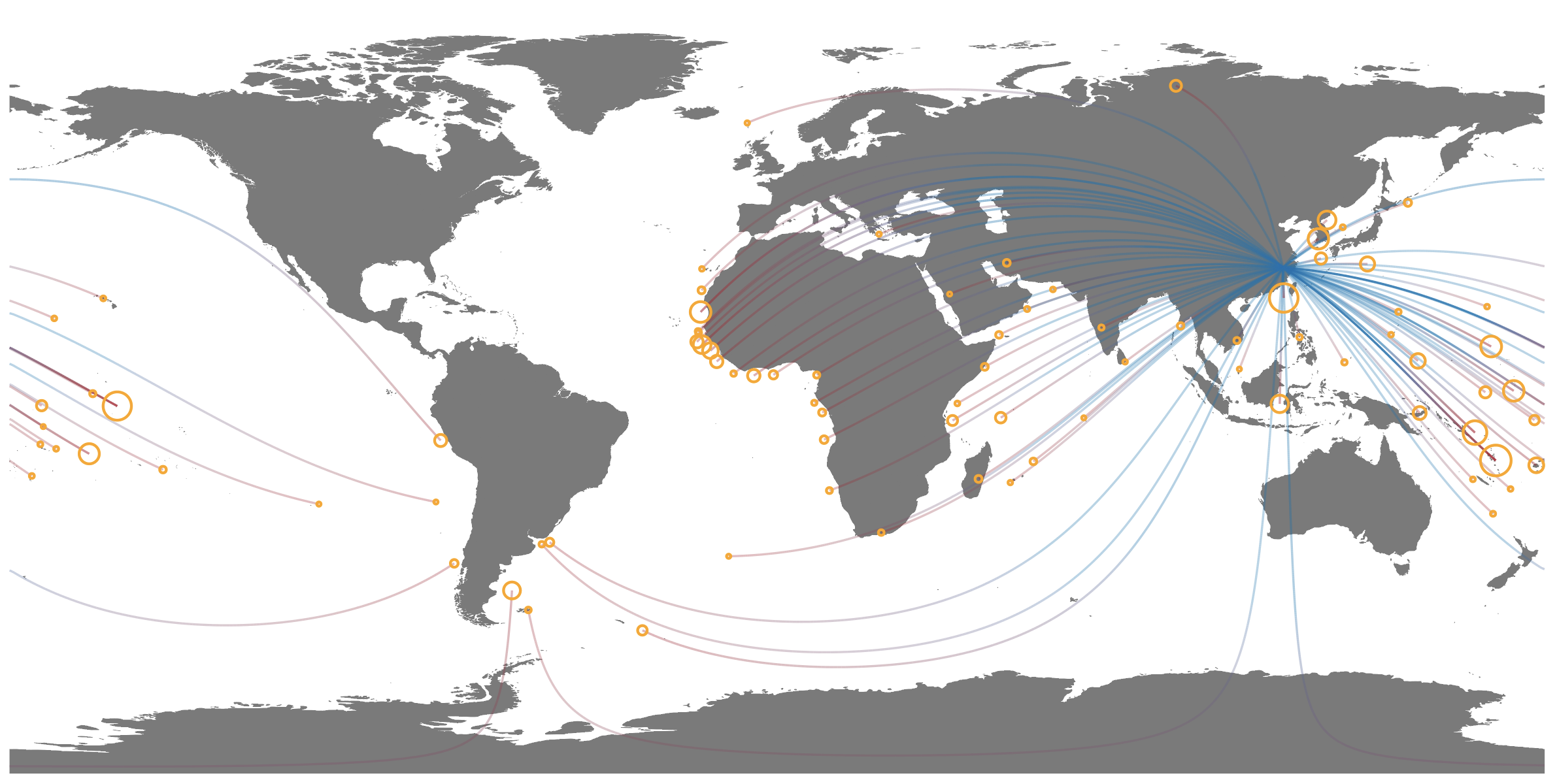
Final plotting
We finally have our dataset ready, and using ggplot and a nice basemap of the world from rnaturalearth we can easily make our map of the Global Network of Transnational Fisheries!
(network_map <- ggplot() +
   geom_sf(data = world_map, size = .2, fill = "gray30", col = "gray30") +
   geom_point(data = network_data %>%
                 group_by(end_lon,end_lat) %>%
                 summarize(fishing_days = sum(fishing_days)),
               aes(end_lon, end_lat, size = fishing_days), col = "orange", shape = 21, stroke = 1.5)+
   geom_path(data = paths,
             aes(X, Y, group = interaction(line_id,subline_id),
                 col = normalized_distance , alpha = fishing_hours),  show.legend = NA) +
   scale_size_continuous(range = c(0.5,10), breaks = c(1000, 5000, 10000, 20000, 30000), labels = comma) +
   scale_alpha_continuous(range = c(0.3,1))+
   scale_color_gradient2(low = "#0571b0", mid = "#0571b0", midpoint = .5, high = "#b2182b")+
   theme_minimal()+
   theme(legend.position = c(0.2,0),
         legend.direction = "horizontal",
         panel.grid.major = element_blank(),
         panel.grid.minor = element_blank(),
         panel.background = element_rect(fill = "white",
                                 colour = "white"),
         axis.title = element_blank(),
         axis.text = element_blank(),
         axis.ticks = element_blank(),
         plot.margin = margin(0, 0, 0, 0, "cm"),
         plot.caption = element_text(colour = "gray", face = "bold", size = 12, vjust = 9),
         plot.title = element_text(face = "bold", size = 14)) +
   guides(colour =  FALSE,
          alpha = F,
          size = guide_legend(title.position = "bottom",title = "Fishing days", title.hjust = 0.5))+
   scale_y_continuous(expand = c(.1,0)) +
   scale_x_continuous(expand = c(.01,0.01))+
   labs(title = "Global Network of Transnational Fisheries",
        caption = "Line color indicates the source (blue) and sink (red) of fishing effort. \n
        Line transparency is proportional to fishing effort.\n
        Circle size is proportional to the total foreign fishing effort in each EEZ. \n
        Data from Global Fishing Watch (2013-2016)."))